
The site redesign went mostly to plan. Two things didn’t, and both had the same shape: nothing threw an error, the CSS looked correct, and the element simply didn’t do what it said. Here they are with the causes, because I’ll hit them again and so will you.
Trap 1: the sticky buy box that scrolled away
The product page has a purchase card that should pin to the viewport while you read the description. The CSS was straightforward:
.product-sticky {
  position: sticky;
  top: 8rem;
  align-self: flex-start;
}
It didn’t stick. No console error, no obvious conflict, the card just scrolled off like any other block.
The card also had a second class, added later, that pulls it up into the title band with a negative margin and puts it above the band’s background:
.product-raised {
  position: relative;
  z-index: 10;
  margin-top: -26.5rem;
}
That position: relative is the whole bug. Both rules have the same specificity, .product-raised comes later in the file, so its position wins and replaces sticky. Nothing warns you, because from the browser’s point of view nothing is wrong. You asked for relative, you got relative.
The fix is to delete the line. A sticky element is already positioned, so z-index works on it without relative.
.product-raised {
  z-index: 10;
  margin-top: -26.5rem;
}
There was a second cause hiding behind the first. The card lives in a WordPress Columns block, and the block editor offers a “vertical alignment” setting for columns. I had set it to “top”, which the editor implements as align-self: flex-start on the column. That makes the column shrink to its content height. A sticky element only travels inside its parent, and a parent exactly as tall as its child gives it nowhere to go. It sticks, technically, for zero pixels.
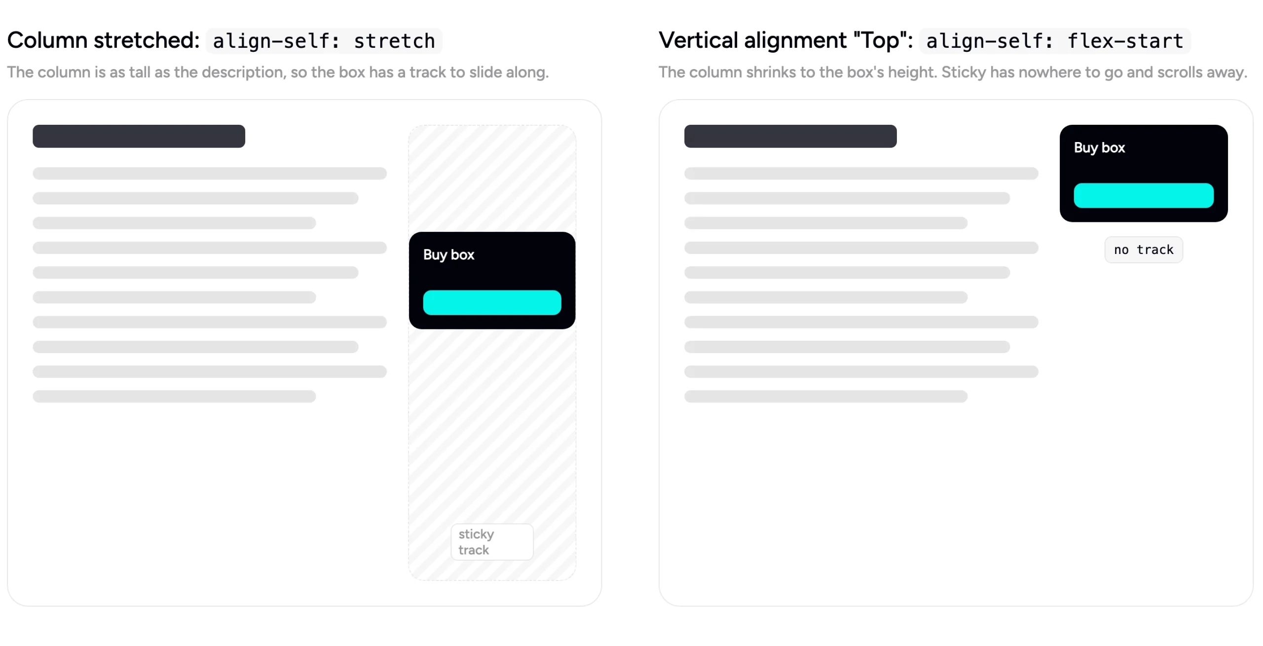
.product-cols > .wp-block-column {
  align-self: stretch;
}
So: for sticky to work you need a positioned element, a parent taller than it, and no ancestor with overflow: hidden or clip. My page failed the first two at once, and each fix on its own looked like it did nothing.
Trap 2: the mobile menu that opened inside the header
The header bar has a blurred, translucent background. On mobile, the navigation opens as a full-screen overlay with position: fixed. After the redesign, the overlay opened inside the header: a menu the height of the bar, cut off at the bottom, scrolling inside a strip no taller than the logo.
The header looked like this:
.site-header__bar {
  backdrop-filter: blur(10px);
}
backdrop-filter is one of a handful of properties that turn an element into a containing block for its fixed-position descendants. The others are transform, filter, perspective, will-change with any of those values, and contain: paint. Once an ancestor has one of them, position: fixed inside it stops meaning “fixed to the viewport” and starts meaning “fixed to this ancestor”. My full-screen menu was positioned relative to the header bar and clipped to it.
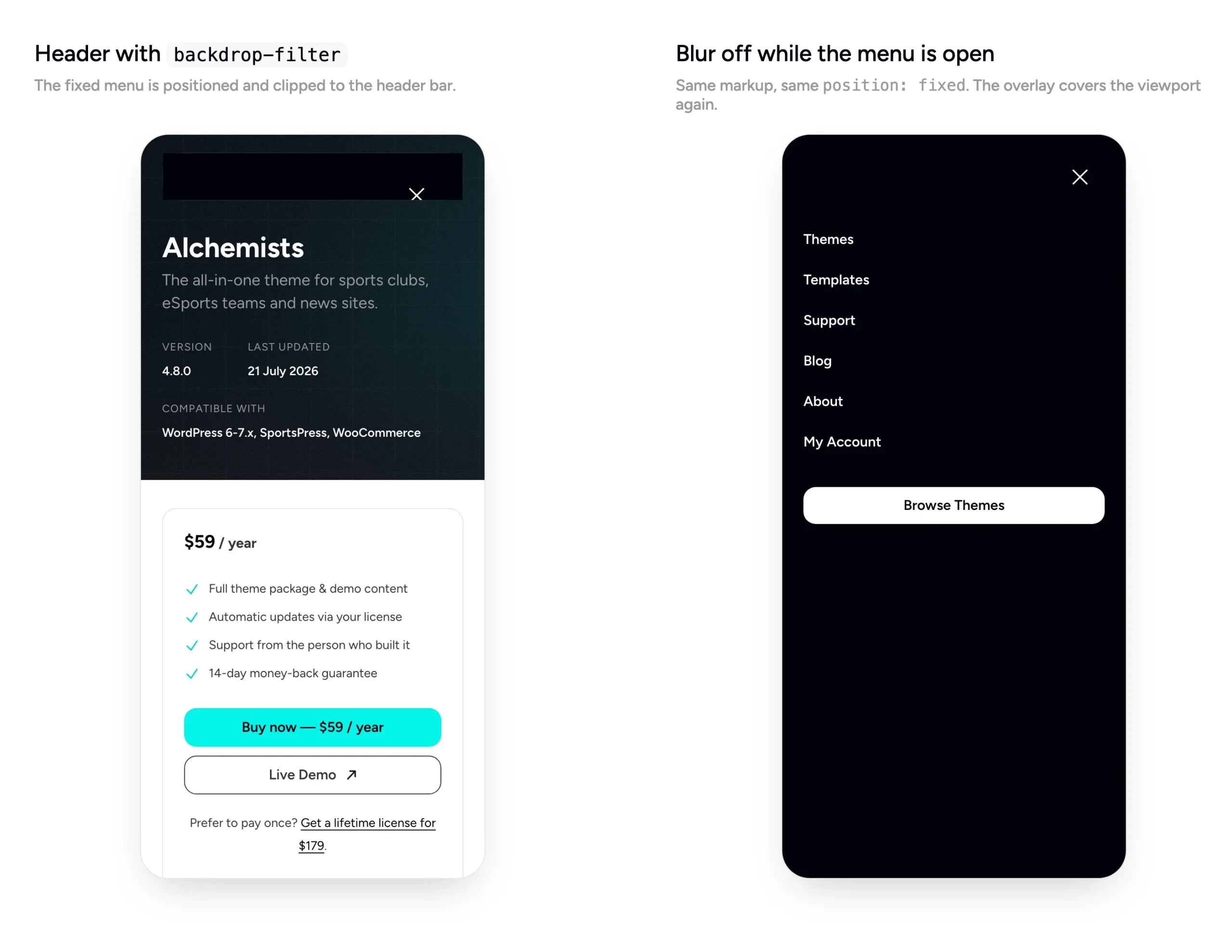
The overlay markup was fine. The fix was to drop the blur while the menu is open:
html:has(.is-menu-open) .site-header__bar {
  backdrop-filter: none;
}
Nobody notices the missing blur behind an opaque overlay, and the menu covers the page again.
The general rule is worth remembering: if a fixed element behaves like an absolute one, walk up the tree looking for transform, filter, backdrop-filter, perspective, will-change or contain. One of them is the new containing block.
Bonus trap: the pattern that didn’t exist
This one is WordPress, not CSS. I added a new block pattern file to the theme and referenced it from a template. The page rendered without it. No error, no placeholder, an empty spot.
Two separate things can cause that. A pattern file without the registration comment at the top (the block with Title: and Slug:) is silently ignored, so the template’s reference points at nothing. And WordPress caches the list of theme pattern files against the theme version, so a new file stays invisible until you bump the version in style.css, even on a development site. I hit both on the same day. Rebuild, bump the version, and the pattern appears.
What all three have in common
None of them produced an error. In each case the browser or WordPress did exactly what it was told, and what it was told wasn’t what I meant. The debugging move that worked every time was the same: stop reading my own CSS and inspect the computed value on the element. position: relative where I expected sticky. A column exactly as tall as its content. A fixed menu whose containing block wasn’t the viewport. The computed styles panel told the truth in thirty seconds each time, after I’d spent an hour arguing with the source.
The design decisions behind the redesign are in the companion post: https://dan-fisher.dev/the-redesign-turning-a-portfolio-into-a-shop/