
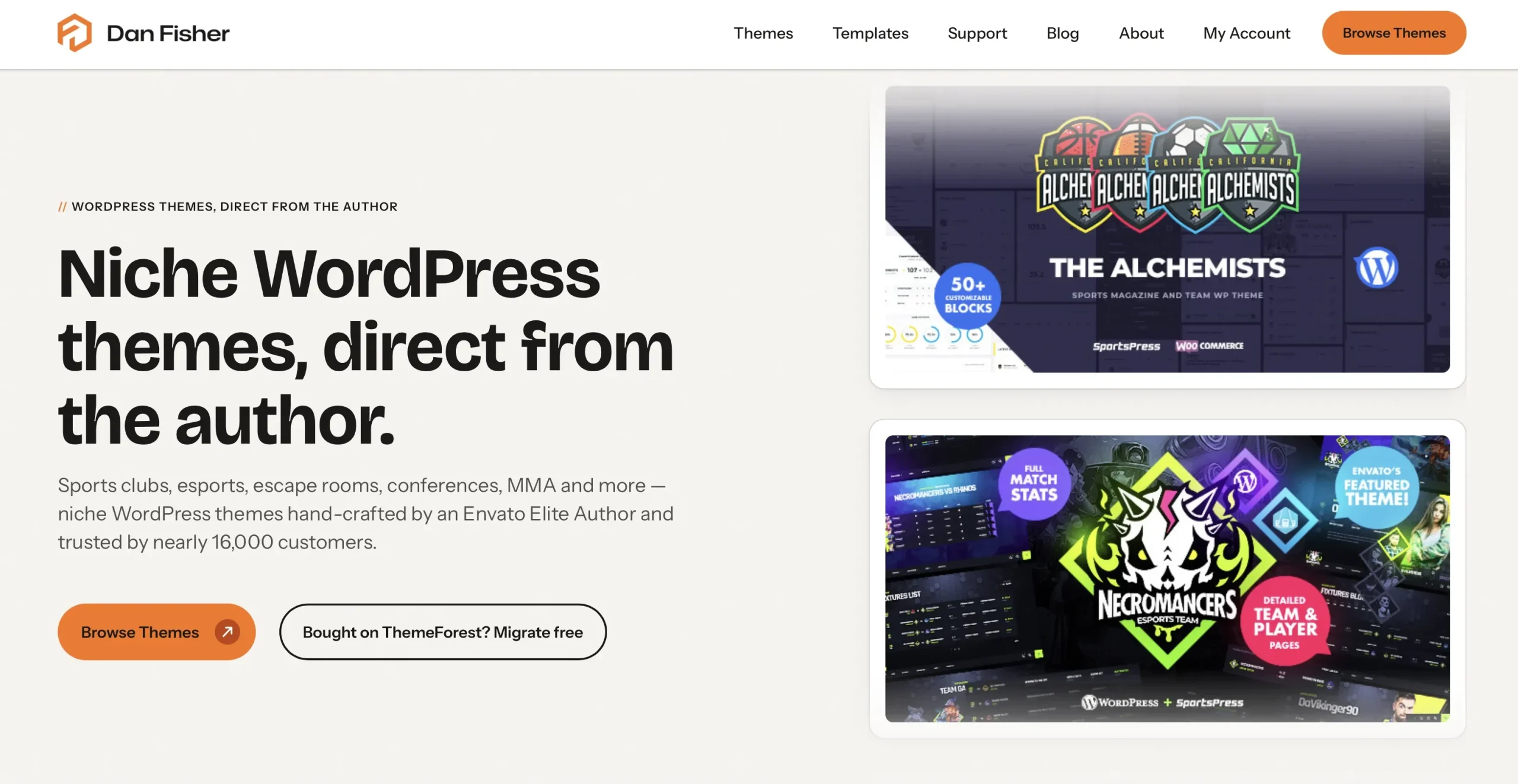
The first version of this site was static. A portfolio: a few pages to show the work and pick up the occasional lead, with every button pointing at ThemeForest. It did that job for years.
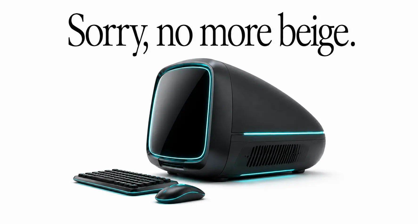
When the shop opened in July, the job changed. People now arrive here to compare themes, read a changelog, convert a purchase code, or open a ticket. I rebuilt the site in WordPress around a prototype I already had, and asked Claude to help fill a few design gaps along the way. It filled them. It also added a palette of soft oranges and beiges that I never asked for, and the result looked exactly like what it was: a site with AI fingerprints on it. If you’ve seen the cream-and-terracotta look on a hundred landing pages this year, you know the one.
So a month later I rebuilt it again, this time on purpose. It wasn’t a facelift. The site’s job had changed, so its structure had to. Below are the decisions that shaped it, including a couple I reversed halfway through.
The beige had to go
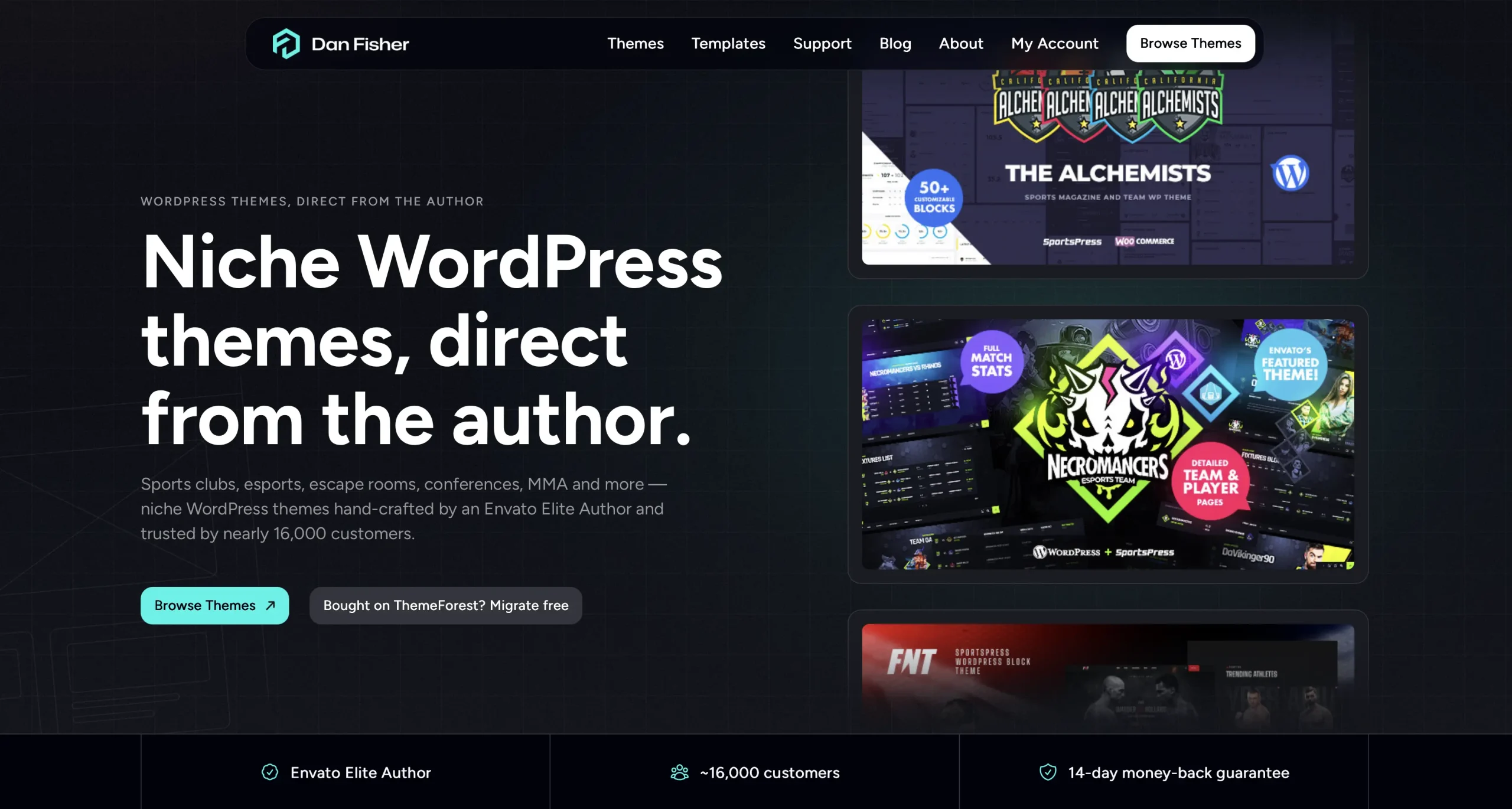
The warm backgrounds were the first thing to leave. The site is back to white, light grey and near-black, with one cyan accent for the things that matter and the orange living only in the logo. It’s less cozy and more like the themes I actually sell, which is the point. A shop for sports and esports themes shouldn’t look like a bakery’s about page.
The lesson I took from it: an assistant is useful for gaps, and dangerous for taste. It reaches for the most statistically common answer, and in 2026 the most common answer to “make this look nice” is beige. The gaps it filled were fine. The palette it chose was everyone’s.
The homepage stopped being a portfolio
A portfolio homepage shows work. A shop homepage has to answer three questions in the first screen: what is this, who makes it, and why buy here. The new homepage leads with the themes, then a section I called “Meet the Maker”, then the blog, then an FAQ.
The maker section was the hardest part to write. I started with the usual “designed and developed by” line and deleted it, because it wasn’t true of every project. On some themes I was the designer, on others I built what a designer partner drew. The section now says that plainly.
I also removed the HTML template teaser from the homepage. The HTML items still sell on ThemeForest and they have their own pages here, but they were confusing the first screen.
Product pages got a dark hero and a buy box that follows you
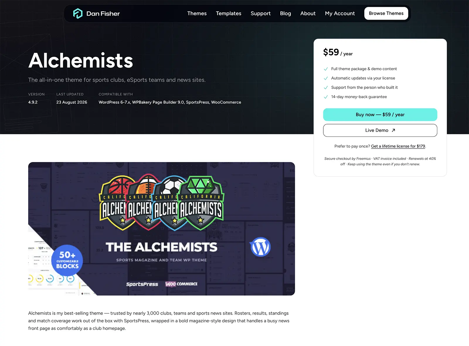
Theme descriptions are long. That’s the point of them: screenshots, feature sections, demo grids, tech specs, a changelog. On the old page the price and the buy button lived at the top and then disappeared for several screens.
The new product page has a dark hero with the theme’s preview image, and a purchase card that sits raised into the title band and then stays pinned as you scroll on desktop. Wherever you are in the description, the price is one glance away. On mobile the card drops right under the gallery instead, ahead of the long description.
I tried the hero in light grey first. Dark won: the preview image sits better on it, and the purchase card stands out against it instead of blending in.
The sticky buy box and the header both fought back along the way; the two CSS traps behind that got their own post: Two CSS traps that ate an afternoon each.
Only one button is allowed to shout
The site runs on a simple button rule. A filled dark button means an action that moves you toward a purchase. An outline button means navigation. Read the blog, browse themes, open the docs: outline. The exception is the Buy Now button on product pages, which is the one cyan button on the entire site. It’s the money button, and it should look like nothing else.
The labels lost their slashes
Every section used to open with a small uppercase label prefixed with two slashes, like // FEATURED THEMES. It looked like code. I liked it for a week. Then it started to feel like a costume, the kind of detail that says “developer” without saying anything to the person reading. And that was actually another AI piece added by Claude. Halfway through the redesign I retired it. The labels are now plain uppercase text, and the pages calmed down.
Blog posts got a table of contents that stays closed
Longer posts now get a table of contents built from their headings. It’s collapsed by default. A table of contents mostly serves two readers: people skimming for one section, and search engines. Neither needs it open, and an open list of headings above the first paragraph makes every post look like documentation.
Below each post there is now a short card pointing to the themes, because most of what I write here is written next to the themes I sell, and someone finishing an article about sports sites should be able to find them.
Comments are off across the site. Anything worth discussing about a theme is a support ticket, and anything else is an email.
Support and account pages say what they mean
The support page now states what support covers: questions about installing, setting up and using a theme, plus bug fixes. Installing or configuring a theme for you, and custom development, aren’t included. That matches the scope ThemeForest buyers have always had, and I’d rather write it down than have a ticket discover it.
The account page splits into two: people who bought here manage everything in the Freemius customer portal, and people who bought on ThemeForest get pointed to their Envato downloads, with the purchase-code conversion one link away.
What I didn’t get right the first time
Two things broke during the build and cost me an afternoon each: a buy box that refused to stay sticky, and a mobile menu that opened inside the header instead of over the page. Both had causes that are easy to miss and easy to hit again.
Small print
The site is a block theme built with Tailwind, and every section above is a pattern, so the next change is an edit, not a rebuild. There is also a newsletter now. The form is in the footer. It sends a confirmation email first, and it will carry posts like this one.